Well, all good things must come to an end. It has been a fun semester and I have learned a lot. I hope that everyone enjoys the holidays and I hope to see everyone next semester.
Tuesday, December 22, 2009
Friday, December 18, 2009
Cheesy ad
 Here's another one of those "Above the Influence" ads. This on is just extra cheesy though, besides the fact that it's about burrito testing. The ad reminds me of some of those old-styled ads in the back of magazines. The ad is very busy but I think that was their intent. It helps you to focus your eyes on the non-busy parts of the page; the one-liner and the website.
Saturday, December 12, 2009
More Type

Earlier this week, I came across one of the coolest sites I've ever been to. Well it's more so the actual pieces than the site. Anyway, it's called typographicposters.com. I've always loved how the actual typography conveys a message to the audience.
It's not that hard
 I had to find an unnecessary process. Well I was surfing around on ehow.com and someone had post the steps for choosing the right difficulty level for sudoku. It seems pretty simple to me. All you have to do is play until the game gets to hard and thats where your difficult level is at. Here's the page:http://www.ehow.com/how_2041654_choose-right-difficulty-sudoku.html
Project 5 revision
 Here is the final version of my project five. I changed the logo so that it stands out more on the packaging. On the back label, I increased the size of the type and and added more hierarchy to the type. Overall I think it's an improvement.
Saturday, December 5, 2009
Process
 For this week's show and tell, I had to bring in an example of a process. The sidebar in the spread above show the process of waxing a snowboard.
Project 5 so far...

 Here's my leaflet. Not really feelin' it at all right now. I think I'm just going to start over. Plus I'm missing some things.
Friday, December 4, 2009
Cool Packaging
 I thought these bottles of cologne were cool. Especially the one shaped like a fist. It's just fitting for Diesel.
Illustrations
 While killing time on the internet, I came across some interesting illustrations from Evgeny Kiselev's portfolio. He has some really cool pieces. Take a look:http://www.ekiselev.com/
Saturday, November 21, 2009
Show & Tell
 I had to bring in a package that had a story to tell. I'm bring in a collectible jar of Mr. Peanut. "Who better to serve America's favorite peanuts than Mr' Peanut himself?"
Friday, November 20, 2009
Cooooool
These images are by photographer Adam Voorhes. They were included in his Exploded Object Series. I just thought they were cool. Here's his photoblog:http://www.voorhes.com/wordpress/Exploded: Bullfrog, Etch-A-Sketch, Phone, Gun


More type
 Here's a logo by Sam Soulek. He's a designer in Minneapolis, MN. He has some cool logos and logotypes. Check out his portfolio: http://www.behance.net/soulseven
Saturday, November 14, 2009
Concept
 Here's the cover of the latest issue of AFSCME Magazine. I thought it was a cool concept. It works.
Counters
 This is an article I came across in Beyond Race Magazine. It's about the band Cubic Zirconia. I felt that just by filling in the counters of the typeface made the page more interesting.
Narrative

Im up to my usual Friday night routine; blogging before class in the morning. For this week's show and tell, we had to bring in something narrative. So I'm go to bring in a comic strip of Garfield. I'm not even too sure if this has anything to do with narrative.
Saturday, November 7, 2009
More Typography
 I was flicking through the AARP Magazine, since I'm preparing for retirement soon, and I came across some cool typography. I forgot what this particular type of typography is called but it is awesome.
Project three post card
 For project three, I pretty much decided to start over. I wanted a more organic feel overall to the ad campaign. This is just the front of my postcard.
Friday, November 6, 2009

Wednesday, November 4, 2009
Logo Design Competition
1. The entry must be on 8 ½ x 11 paper. Please include your name(s), school & academic classification (freshman, sophomore, junior, senior, graduate student), phone number, and email address. 2. Logos should include the phrase “Classroom 34”, and contain no more than 3 colors. 3. Contestants must understand that entries must be their original work and that if accepted, the logo may be published on Classroom 34 website and used on organizational promotional marketing pieces, including but not limited to, flyers, brochures, t-shirts, etc. The design must be 100% your own work; adapting an existing picture or artwork is not acceptable. Submissions cannot be returned. 4. All submissions must be received by November 15, 2009. Late entries will not be considered. Artwork may be emailed toinfo@classroom34.com Please include your name and contact information (phone and email) on all submissions. 5. The winning design will be unveiled on December 1, 2009. 6. All submissions will be screened and judged by a panel appointed by Classroom 34. Logos will be judged based on creativity, originality, aesthetics, use of space and color. All submissions become the property of Classroom 34 and will not be returned. 7. The decision of the judges is final. Awards: One winner will be chosen to receive a $150 cash prize. Disclaimer: Classroom 34 reserves the right to use or not to use the winning design as a school logo. We also reserve the right to make modifications to the artwork based on design needs. We look forward to seeing your work!Classroom 34 - Logo Design Competition
Welcome to the Classroom 34 logo design competition!
Friday, October 30, 2009
Design type
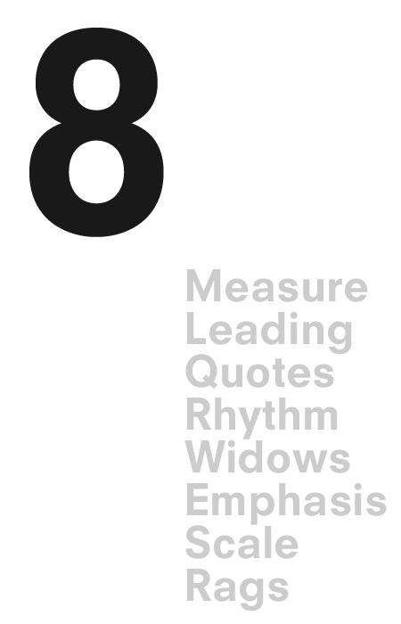 Earlier this week in my hypermedia class, we began working with CSS. While looking for pointers on the net, I came across this list of ways to improve typography within design. Though the list was referring to CSS, the tips are useful for other mediums too. Take a look: http://www.aisleone.net/2009/design/8-ways-to-improve-your-typography/
Subscribe to:
Posts (Atom)

